
How do you go mobile?
Businesses who are getting to grips with the online space have a new challenge that they can’t ignore: the rise and rise of mobile devices. It’s hardest for those who caught on to the idea of websites in the last decade, and invested in what they thought was a long term online solution. In 2007, when the first-generation iPhone arrived on the scene, the idea of accessing a website on your phone was very new, and sites were restricted by the small screen sizes and low volume of data transmitted over phone systems. A few huge, high profile sites delivered information that could be accessed on the average mobile phone – not your local plumber!
The mobile space has exploded. It’s easier than ever to browse on the move, and the simplicity of picking up a tablet to look for local goods and services means that companies who want to be found online have to take account of what information is visible on small screens. But how do you go mobile?
Responsive and mobile-friendly websites
The most appropriate solution for a small business is to ensure that their website is either fully functional on a touchscreen device, or responsive i.e. what you see changes according to the screen size. This website, for instance, works perfectly on a touchscreen device but does not display differently – it just shrinks to fit. The biggest danger we see is sites built using Flash (thankfully rare these days) or which rely on clever mouse-hovering features – neither of these work on mobile devices. Have a look at how your own website behaves on a small screen: can you see what you want to see, or are you losing business on mobile?
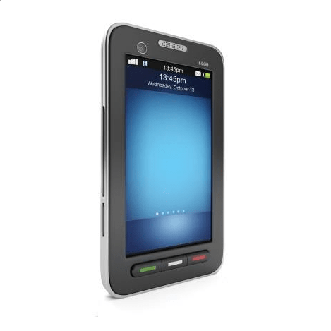
Mobile versions and Mobile Apps
Specialist mobile versions or mobile apps need some thought behind them. They are a hugely successful and useful tool for the right businesses. People viewing on mobile may spend less time trying to navigate than they would on a PC, so what do you want them to see? What’s the message that needs to be there in front of them? A promotion? A gallery? Push notifications (realtime messages to your clients)? Latest updated information? The options for a well though out app or mobile site are endless.
There are plenty of tools and offers out there to build a mobile version of your website or an app, but think it through! It’s not a sticking plaster. If your website isn’t working on mobile, you’d be better reviewing your whole online presence and getting the message consistent and right across all devices.
What’s the next step?
What do you want to say, how do you want to say it? Don’t just bolt on new technology because it’s there – make it work for you as part of an overall strategy. it’s the old joke: “You want to get there? Well, I wouldn’t have started from here!” If you can’t see how it fits, go back to the strategic drawing board. Get your digital footprint right, and the rest will follow.